INSIGHTS / HUMAN-LED AI
I finally built my own website. Then I kept going.
Being my own client, building with AI and finding out just how many decisions live inside the words “my own website.”
FINALLY, MY OWN BRIEF
Apparently, I was the client.
I have spent more than twenty years helping organizations make their digital experiences clearer, more useful, and easier to act on. Then I decided to produce my own website. Excellent. A straightforward little project with an experienced client who knew exactly what she wanted.
The client was me. You can see where this is going.
When the name above the door is your own, every decision gets strangely personal. You are choosing which parts of your working life deserve the space, how to explain the connections, and which photograph makes you look like someone a person might actually want to work with. Meanwhile, a perfectly reasonable headline starts to feel as though it requires a constitutional amendment.
But I wanted TaraODoherty.com to exist as something I had properly shaped. A place for the research, the strategy, the creative work, and the ideas still taking form. Somewhere a visitor could understand what I do, see the evidence, and decide whether we should talk.
So I finally built it. And then, in a development that will surprise absolutely nobody who has worked with me, I kept going.
A website with a job to do.
The temptation with a personal website is to include everything. Every discipline. Every client. Every interesting project. Twenty-plus years of experience, presented with the restraint of someone packing for a weekend and bringing a second suitcase for possibilities.
That is a useful moment to return to the visitor. They have a challenge to solve, a team to support, or an idea they want to move forward. They need to know whether my experience is relevant and what working together might look like. They should be able to find that out without first becoming an expert in my career.
That became the brief. The homepage would introduce the value clearly. The work would provide the substance. About would explain the person and the thinking. Services would help someone find a practical starting point. Each page needed to earn its place in that conversation. For me, personal website design starts there: connecting personal branding with an experience strategy that helps someone decide what to do next.
My work connects user experience design, research, product strategy, leadership, and artificial intelligence. The connections matter. Research helps us understand the problem. Strategy gives us direction. Design makes the direction tangible. Leadership helps people deliver it. AI can help accelerate parts of the work. The site needed to make that range understandable, rather than simply announce that I have been busy.
It needed to feel like there was a person here.
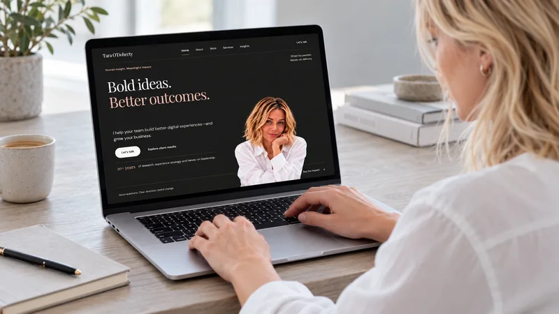
I wanted the design to have confidence and warmth. The charcoal gives it presence. Warm ivory and restrained blush make room for the content. Large editorial serif headlines bring personality, while the simpler body type lets people settle into a longer read.
The homepage says “Bold ideas. Better outcomes.” It is a compact promise, which means the rest of the site has to get on with supporting it. A headline cannot do the work of a portfolio, however attractively it is typeset.
Photography was part of that balance. The homepage portrait introduces me alongside the message. The About page opens out into an environmental photograph, with the introduction held in a dark panel. Same person, different role in the story. I wanted someone to get a sense of who they might be working with before we had a conversation.
Of course, a lovely composition still has to survive the arrival of actual words. The image needs to support the message. The text needs to be readable. The heading needs room. Creative website design involves those decisions together; otherwise, you have a very handsome obstacle course.
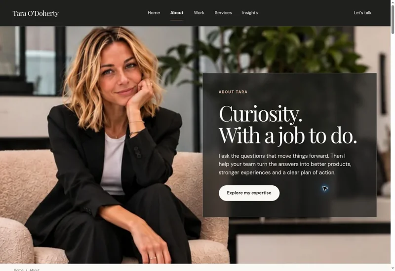
What I like about the result is that it gives the site a recognizable rhythm. A short statement, a photograph, a piece of evidence, a fuller explanation. There is room for personality without making every section audition for the lead role.
Show the work. Explain the contribution.
A UX portfolio can look impressive and still leave someone wondering what you actually did. I wanted the case studies to help answer that question. The challenge, my role, the approach, and the results all needed to connect.
The Work page brings together thirteen client case studies, alongside independent product work. A consistent card system makes the collection easier to browse. The detail inside each story preserves the differences between the problems.
Helping someone complete a donation to SickKids is a different job from helping an AT&T customer troubleshoot a device or making a clinical workflow clearer for an Alcon team. The audience, the pressures, and the decisions change. That is the interesting part of the work, and it deserves more than a logo and a broad claim about transformation.
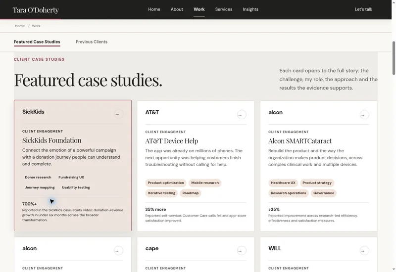
There is also a responsibility in how the results are described. Client outcomes reflect wider teams and programs. My role needs to be clear within that context. Independent ventures need to be identified as my own product work. Confidence is useful; accuracy is what makes it credible.
The goal was to give someone enough substance to decide whether they wanted to know more. A good portfolio should open a useful conversation.
The creative work needs room—and a proper introduction.
There is a tendency to put strategy over here and creative execution somewhere else, as though the two should only meet at an annual conference. In practice, I enjoy connecting them. The words, the visual choices, and the experience are where a direction becomes something people can respond to.
The Voxie social work is one example: editorial imagery, playful observations, copywriting, and a consistent brand personality. Seeing the pieces together tells you something a paragraph about “creative capabilities” never quite manages.
We explored a creative gallery during the website build. I have since removed it from TaraODoherty.com because we want time to package the work properly. There is no gallery on the current site. I want the work to have the context and care it deserves before deciding how to present the collection.
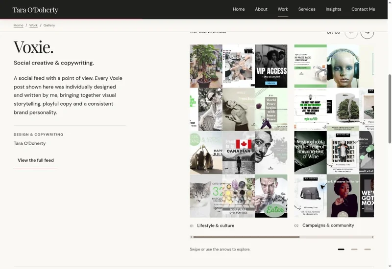
I have kept that earlier design here as part of the story of making the website. It shows an approach we explored, rather than a feature you can visit now. Sometimes a useful revision is deciding that something needs more time. A space on a website is not a deadline in disguise, however convincingly it may behave like one.
Oliver brought speed. I brought opinions.
I built and refined the site with Oliver, my AI collaborator through ChatGPT. I bring the context, strategy, creative direction, and final decisions. Oliver helps me explore options, develop content, implement changes, and review the details. Between us, there is very little shortage of material to reconsider.
What makes that collaboration useful is the distance it removes between an idea and something I can examine. A proposed headline becomes a headline on a page. A layout becomes something I can look at alongside the actual photograph and copy. Then I can judge whether the pieces belong together.
That is also where a vague brief becomes expensive, even when the first draft arrives quickly. “Make it better” leaves a great deal to interpretation. “This page needs to explain what I help a team do before it asks them to contact me” gives us a specific problem. So does “The image is overwhelming the introduction” or “This case study needs to distinguish my contribution from the wider team’s outcome.”
AI makes it easier to produce another option. Experience helps me decide whether another option is what we need. Sometimes the next move is a rewrite. Sometimes it is deleting a section. Occasionally, the correct decision is to stop touching the perfectly good thing we have already made. I remain open to this concept.
I explored the collaboration in Building with AI: Beyond the First Draft. Building a website with AI has made that balance practical: fast production, followed by human review, specific feedback, and another pass. That is what human-led AI means in my own work.
About those revisions.
There is a number attached to all this, and it deserves a little context. On October 28, 2026, I checked the complete saved history for TaraODoherty.com. Before this article was first added, the site was at version 138, with every saved version from 1 through 138 in the record.
That means 137 saved revision checkpoints after the first version. It does not mean 137 complete redesigns. One save might bundle copy changes, image adjustments, and updates to several pages. Other ideas get explored and discarded before they reach a saved version. The history counts checkpoints, rather than every small decision involved.
The article was first published in version 139. Version 140 revised the story and fixed the issue that could leave its text invisible. By November 2, 2026, the latest saved version was 153, before this update. Apparently, writing about iteration was an invitation to demonstrate it.
| Milestone | Saved version |
|---|---|
| Before this article was added | 138 |
| First publication of this article | 139 |
| Earlier article revision and text-visibility fix | 140 |
| November 2 snapshot, before this update | 153 |
A dated snapshot of the latest saved Site version, checked November 2, 2026, before publishing this update. The version number includes the initial version. It is not a live counter or a count of individual edits, prompts, hours, or complete redesigns. Earlier screenshots remain labelled with the version they show.
The changes have included positioning, page structure, case studies, photography, navigation, mobile layouts, contact details, search metadata, and the Insights section itself. The number tells you the work has continued. The more useful question is whether each pass makes the experience clearer.
The work has grown beyond my own front door.
The same November 2 snapshot puts pixs.ca at saved version 389, TheCXPR.com at 121, Science of Next at 30, Voxie at 10, and Christine Fitness at 9. Add TaraODoherty.com’s 153 and that is 712 saved versions across six projects. Separate concepts and private preview projects are excluded.
These are checkpoints across different kinds of work: a personal portfolio, a shop, a review service, and other ventures. More versions do not automatically mean a better website. They show how much happens after the first draft. The useful measure is whether the next pass helps someone understand, decide, or act.
I love that Oliver checks the browser.
I love that Oliver does the QA, too. An idea can look perfectly reasonable in a conversation and become rather less reasonable when it meets a small screen. I want to see what happens to the actual page: the spacing, the image, the dropdown, the next step. The browser has a useful habit of being literal.
A recent example came from pixs.ca. The browser QA reported no horizontal page overflow at 320, 390, 768, 1024, or 1440 pixels across eight representative product types. In plain language, the pages checked stayed within the screen width instead of making someone scroll sideways to reach the content.
That is a specific result from the product pages checked at that point in time. It does not establish that every page, interaction, or accessibility requirement has passed. But it gives me something concrete to review, rather than a cheerful “looks good.” I can ask what was checked, what happened, and what still needs attention.
That follow-through is part of what I value in this collaboration. We make a change, examine the result, and fix what the check reveals. I still bring the direction and decide whether the experience works for the person using it. Oliver helps make the checking practical enough to keep doing. Glamorous? Occasionally. Useful? Very.
The small details have excellent stamina.
Once the main pages exist, there is a long tail of questions. Does that link explain where it goes? Is the copy readable against the image? Does the page still make sense on a smaller screen? Is the next step obvious? Have we made the important thing easier to find, or merely given it a nicer outfit?
The less visible work matters, too. Page titles, descriptions, image text, internal links, article metadata, and sitemap coverage help describe what is actually here. They belong in the build alongside the creative design. Nobody visits a portfolio hoping to admire its sitemap, but the quiet details still have a job.
This article supplied a fairly direct reminder. A scroll animation could leave the long body of text invisible on shorter screens. The writing existed; the reader could not see it. The fix was to keep article copy visible by default. A useful website needs both the story and a reliable way to read it. Ideally at the same time.
That is why reviewing the actual experience matters. A page can contain the right material and still fail at delivering it. Finding and fixing that gap is part of the work.
Finally built. Still building.
The satisfying part is seeing the connections in one place. The research, the creative work, the leadership experience, the client stories, and the independent ventures now have a home. Someone can explore them at their own pace and find the thread that matters to their challenge.
It also gives me somewhere to keep developing the work. I can add a case study, share a practical idea, show another piece of design, or improve an explanation when I find a clearer way to say it. The website can grow with what I am doing.
If you are trying to get your own site into the world, start with the person who will use it. What do they need to understand? What evidence would help? What should happen next? Those questions give the creative work a purpose and give the revisions a direction.
Then make something you can examine. Be specific about what needs to change. Keep the parts that work. Publish when it is useful, and take responsibility for improving what you learn from there.
At the November 2 snapshot, my own website had reached saved version 153, before this update. I am pleased it exists, pleased the work has somewhere to live, and aware that I have just written an entire article explaining why I may yet change a headline.
LET’S TALK
What are you ready to build?
If you need help connecting your story, your audience, and your digital experience, start with a note.